Tuesday, April 26, 2011

Sayre BP14 IARC 221

OBJECT: The DAR Molded Plastic Chair, by Charles and Ray Eames.

I love this chair and plan to purchase a few as soon as I start making more than minimum wage ha-ha. Its great design and the bold and complete uniform shapes and colors offer a simplicity yet complexity with the R-wire bottoms. They also look extremely comfortable. The modern look these chairs exume offers a playful yet professional idea of design.


SPACE: National Mall

Last summer i got to finally visit DC and see what i would think is sort of an equivalent to the Forum Romanum and since i haven't been there i'd say this is a pretty cool space.
The idea is that these buildings were all created in order to show the greatness of the capitol, the triumps and failures, the history and the honoring of those who passed in order for us to live the way we do. It's one of the few places that are obviously constructed in representation of these ideas and thats what makes it a special place. The purpose of these buildings are like the old honorary Roman columns, Triumphant Archways or Temples that honored things which were important for the Roman people. I find that this is definitely represented in the National Mall.


Building: The Villa Savoye

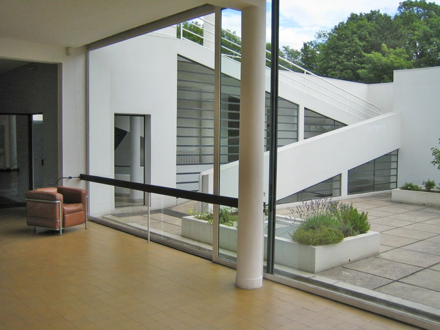
It's redundant I know, but I love this building. Everything about it is jus so completely ahead of its time when looking at other buildings in the Roth textbook. The ability for an open space plan and the long distance views inside the house are just phenomonal examples of a design language that I really enjoy. The ribbon windows surrounding the house and the outdoor terrace and roof garden bring all aspects of the outdoors really within the building. The playful curve of the roof garden wall allows the building to have some assymetry to it while the rest of the outside of the building seems to be the same.

Place: Pittsburgh

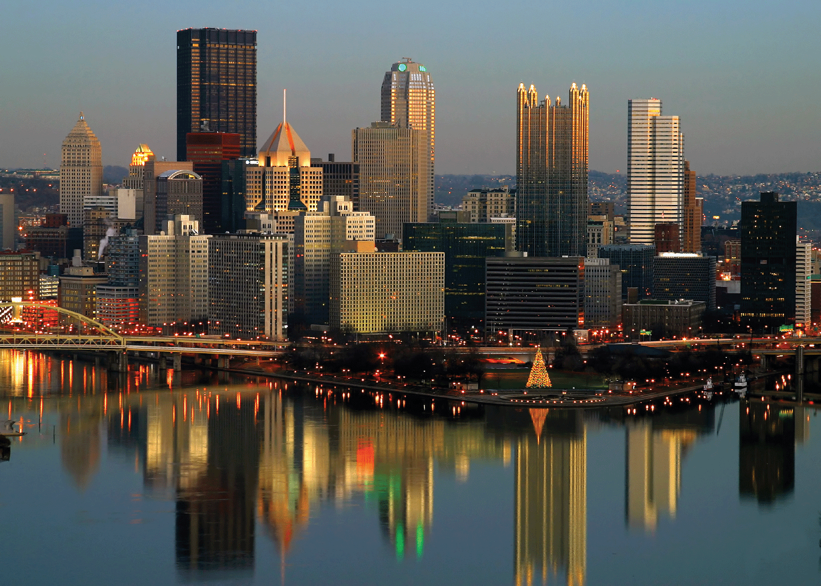
Well, this was already said by Dr. Lucas, but I'm from Swissvale, P.A. which is about 15 minutes out of Pittsburgh. Generally I tell people I'm from Pitt just to simplify things but even in the surrounding suburbs of the area you can see the effect the hills have on buildings. Many of them allow for basements to be dug in the side of hills (which is something that I don't see very much of in North Carolina) which adds to the floors, because in pittsburgh many buildings have 4 floors due to the high urban population. The three rivers that run through downtown really set the stage for great lighting to occur (and great fireworks) at nighttime as its reflected. The valley of buildings stretch out for as far as you can see when you ride the Incline up some of the hills. For me, this is my San Diego, with less history for the rest of the world, but a world of history for me.

Saturday, April 23, 2011

Sayre Unit Summary 3 IAR 221

Explore
The connected world, globalization, the ability for a design region to be transported across the oceans to new worlds: These are all the realities of the 3rd unit which have a direct relationship to Architecture.

Exploration is the perfect title for this unit as the overarching theme of architecture as countless numbers of designers strive to create the design language of the time, which would be used to base later designs. The arguments made between these architects indeed find some basing in previous design types with some resurgences of Gothic and Classical design, yet move very far past these basic ideas to the point where their themes are hardly recognized.
Art Nouveau | Bauhaus | Post Modernism
Recalling past design through the ideals and basic “phonetics” come Art Nouveau which was mentioned in class as not having past designs. I agree with this idea in the light of the great metal works created during the hay-day of the world fairs in the rapid construction (and subsequent rapid deconstruction) of the mega steel framed structures. I also think in some cases that Baroque found its way into influencing some aspects especially in the work of Antonio Gaudi and his Casa Mila. Almost every aspect of this building represents a material that it (Atomically) is not. Concrete blocks and steel frame transform into a apartment complex carved into a Cliffside in Barcelona (Roth 511). Other aspects which also represent the high and extreme decorative aspect of Baroque appear in the Tassel House, by Victor Horta in Belgium. The motif of Horta’s staircase begins on the floor with flowing tile work, continues on the railing, and flows to the columns and flairs out, in a continuing cycle which climaxes on a hanging light fixture also of a curvilinear design. Over the top and impressive, I feel Art Nouveau has heavy insight into the Baroque era.

Art Nouveau | Bauhaus | Post Modernism
The expansion of Scandinavian designs find its headquarters in the Bauhaus, the institute of design Dessau, Germany. Founded by Walter Gropius and later building reconstruction and design accompanied by Richard Meier, this institute was the lamp which shed its design light upon the globe. Due to the Second World War, designers who studied and taught design defused across the landscape resulting in their talents influencing buildings in the regions they eventually ended up in. Industrialized architecture was an idea shared by many great designers including Ludwig Van Der Rohe, and Le Corbusier who designed buildings such as, respectively, the German Pavilion, Barcelona, Spain, and the Villa Savoye in France. These influential buildings represented some of the highest ideals of the Bauhaus of industrial design, dematerialization and a quote from Le Corbusier “a machine for living.” These ideals grappled with the hand crafted designs of Frank Lloyd Wright, but later found solace as years went on and design language changed.
Art Nouveau | Bauhaus | Post Modernism
Post Modernism. The conglomeration of many design languages which became understood by some, confused others, and in the hands of masters became arguably the top in expression of design. An important aspect of this age is the realization that function plays a most important role in the design of buildings. Good design for all. Not for people to conform to the wishes of a high browed designers view of perfection in structure, but the ability to provide and serve the public in ways which fulfill commodity, firmness and delight. I think this era offers very important aspects of all the previous design languages in order to produce something entirely new. The image I think, although it is certainly not from one of the most world renowned designers of this period such as Richard Meier, to some extent Le Corbusier or Frank Gehry, represents the idea and purpose of Post Modernism and combining aspects to delve into the unknown. 

Gunter Domenig, Volkermarkt, Austria. Example of steel frame.
Gunter Deomenig’s industrial office building Volkermarkt, Austria is a representation of the idea’s which grew out of the Bauhaus comingled with the steel frame and stunning buildings of Art Nouveau. “While this seemingly unfinished structure appears deliberately provocative, the similarly evocative structural expression […] results primarily from pushing the engineering implications of structural systems to their logical artistic and poetic limits” (Roth 598). These ideas were used by the designer to produce an extreme statement while not sacrificing the ability of this building to succeed functionally.


Gunter Domenig, Volkermarkt Austria. Stretching of structural
design
Explorations found voices for the spread of architecture to places which it would have never grown on its own. Expressions in Art Nouveau found their basis in Baroque while striking out on their own to the point where these bases were hardly defined. Bauhaus spread a tradition of modernism stressing the dematerialization which would later appear in many buildings found in Post-Modernism.  The aggregation of these ideas became Post Modern design which continues to this day in many forms. In all the units, I found this one very important to my understanding of design as it has shown where the aspects of previous design have seeped into the language of today. The bone structure which was Unit 1 was added to by the Muscle of Unit 2 in order to reveal the skin and features I am able to discern in Unit 3. The main idea remains the same: in finding that which fulfills the status of modernity.


Sunday, April 17, 2011

Sayre RR13 IAR 221


Rules seem to be in an ever changing flow between construction and deconstruction.
This change seems to be the only constant.


Inspiration is an over arching aspect of many types of architecture. The work of one designer can be reflected in another in particular aspects of many buildings. In the case of Richard Meier, and the Getty Center II in Los Angeles(1984), Roth has determined that its inspiration was from Le Corbusier.

Getty Center II, Meier: Circular Geometric              Villa Savoye, Le Corbusier: Geometric

                         
credit                                      creditsavoye 
These two views depict architecture which in some ways is related, and in some ways have been expounded upon. The basic ideas in which parts of the Getty Center were based upon are found in buildings like the Villa Savoye. Some of Le Corbusier's rules are followed by this conglomeration of 5 buildings which make up the Getty Center. 
  • In this particular aspect, the curving rooftop wall of the Villa Savoye has been dropped below.
  • The ribbon windows which were a defined detail of the Villa Savoye have been draped upon this curving wall which has become a repeated motif of the Getty building.
  • The columns on the outside, or piloiti's as Le Corbusier called them, remain as they were.
  • The geometries of the two buildings find that the Getty building has made this form the essence of the building were as the Villa Savoye may have just discovered how it could look.
While the inspiration has a extreme hold on how the buildings look, the essence of change remains a part of architectures future. Understanding today's architecture takes into account what has gone before, and envisioning what can "go" in the future. While change is a very important aspect, the designer Richard Meier "remained consistent in [his] refinement of canonical modernist minimalism and reduction of materials." Essentially, the use of white and the smoothness of the buildings remained a major point in Meiers work, and the Getty Center II is an excellent conglomeration of these ideas placed onto the varied facades of the buildings.


A closer view of the Getty Center. Notice that many aspects that are circular, if flattened, look like some works of Le Corbusier. The importance of minimalism is evident here, yet Meier changes somewhat by using the travertine stone on the outsides of the buildings.
Getty Center II, Los Angeles Richard Meier Over head view. Scale of this center is explained by Roth to be one of the most expensive buildings of the times at $1,000 per square foot, rounding off at around $1 billion dollars.


Sayre BP13 IARC 221

Scandinavian:Legacy

Legacy. A word which demands attention. Also a word used to describe something not just of importance but also of influence.

The spread of Scandinavian design throughout the world brought modernism to many shores. A shore in particular can be observed from the building designed by Alvar Aalto, a Finnish architect who during World War II taught at Massachusetts Institute of Technology.

Out of the many architects of this age i feel Aalto's work is imperative to the movement of design through the times because of all the modernist architects Aalto embraced functionality.

THE BUILDING: "Baker House"


Alvar Aalto's Baker House, Massachusetts
A students dormitory, this building was constructed to fit the uses of a humans point of view. Very much unlike other architects of this time who were convinced that the design of the building was static and it was the people who had to dynamically shape themselves around the architecture. Very different from other buildings of the time the Baker house also curved to fit in to its appropriated space unlike other modernists buildings which were very cube-like. This building offered views of the river  in the bedrooms and the city from the other sides. Scandinavian design in the purpose to achieve functionality is the essence of what I think is an important legacy to pass to other designers. With embracing the needs of people a building succeeds in its most essential, and carnal, purpose. Alvar Aalto's scandinavian design lies in importance with "accomidating utilitarian function."

Monday, April 11, 2011

Sayre RR 12 IARC 221


Embedded Purpose

A building is always created for a more or less specific purpose; an apartment for living, a library for reading and research, a factory to create. Embedded in the design of the Philarmonie, Berling by Hans Scharoun is the purpose of music.

 Embedded purpose and functionality
The exterior of The Philharmonie, shaped by its interior
photo credit


 It is embedded so deep in the idea of the building that its influence is shown in its very uncommon design. The exterior is shaped in order to agree with the demands which are placed upon the interior in its function as well as its characteristics of commodity and delight. Delight more specifically concerned with the feeling meant to be conveyed by Hans Scharoun.

Designed with Purpose
The Philharmonie, Berlin. Embedded with the idea of music
photo credit

  • The building form is shaped by music not only to be acoustically sound but to surround the musicians with the audience at every angle
  • Hans Scharoun: "Music is the focal point. This was the keynote from the very beginning. The orchestra and conductor stand spatiall and optically in the very middle of things; if not in the mathmatical center, then certainly they are completely enveloped by the audience." (Roth 554)
  • Scharoun describes the building as allowing the audience and the performers to be a single community  in a very natural setting
Philharmonie Community
A Community of Music. The central stage surround creates a more intimate feel than a stage in front of seating. Intimacy comes through the availability of looking in at any angle.
photo credit
The Philharmonie by Hans Scharoun displays a perfect example of embedded purpose in the form of Music being the keynote. Coupled with this idea plus the structural changes observed by Roth: "the many angleed surfaces and the convex curves of the ceiling (mirrored by the angles and curves of the exterior) disperse the sound well." Exceptionally executed functionality fills commodity and delight in one fell stroke, and firmness follows after in this music hall.

 The following link is just a small example of the community created by Hans Scharoun's design


Sunday, April 10, 2011

Sayre BP12 IAR 221

The 111 Chair
Inspired by colors found in nature
Designed by those who care about it.
EMECO: Good Design 4 All


Taking an excerpt from the Chair Cards come's the 111 Navy chair. What better way to accentuate good design for all but to do so in a manner that is better for everyone; even those who aren't sitting in it.


The 111 Navy Chair gets its name from being made out of 111 plastic Coke a Cola bottles, sort of partnership the two have created together (the Coke trademark is coupled with the emeco one on the underside of the seat) to develop a more sustainable world. This not only reuses old plastic but has been claimed by Emeco to last up to and possibly surpass 150 years. So these chairs will be something you could definitely pass down to future generations. 


A sustainable word from the Pennsylvania housed company owner Gregg Buchbinder


"When Coke came to me with this project I jumped on it. It’s a huge investment for a small company, but we have the potential of reusing the PET from about 3 million plastic bottles a year. That’s a lot of bottles and a lot of chairs too. The new chair is the strongest, and most beautiful we can make. We’ve turned something you throw away into something you want and can keep for a long, long time.” 


I also want to highlight that it was indeed Coke that wanted to do this, which in the end may only be a PR stunt, but is still a definite move in the direction many things in this world should take.


Thursday, April 7, 2011

Sayre Unit Summary 2


Reverb

The overarching and imperative ideals developed from my understanding of the second unit, “Reverberations” are:
‘Writing rules, breaking rules, and then revising them.’
And…
 ‘Echoing Past Design to produce that which is considered modern.’
These two phrases describe how the movement of design changes across time as well as space (in the idea of moving around the world) and how the philosophy and ideas of the time shape architecture.
Gothic|Renaissance| Baroque & Rococo
Spires, arches, immensity, high detail. These words describe the confluence of cathedral buildings that occurred around the 12th century. These tall buildings, generally using the cruciform shape, were made to make a statement of dominance on the land in the name of the faith Christianity. The dematerializing of the structure to make these buildings large sometimes led to their demise in collapse, through their effort to point towards the sky and possibly God. As Jon Pearl said: “God is the sky, God has no boundaries.” Examples of these buildings include the Cologne Cathedral, Germany and Amiens Cathedral, France. Vaulted ceilings and stained glass were used in concert with each other to control the light filtering and lighting the surfaces within.
Gothic|Renaissance| Baroque & Rococo
The Renaissance was the movement, from roughly 1400 to 1600 C.E., defined by the way the aristocracy or wealthy and educated elite came to think about the world. This was represented in many aspects of the burgeoning culture and particularly in design. It also interestingly completely dismisses the Gothic period and instead looks farther back to represent the ancients. Leland Roth’s book “Under Standing Architecture,” takes it a step further saying that people in the Renaissance “sensed that they were at the start of a new age of vast possibilities, an age that could equal the achievement of the ancients” (Roth 253). This statement paves the direction in which design language flows, by equaling the ancients and basing building styles upon them while adding to them the scope of the times. These ideas then created the rules of architecture to come, as well as laying the foundation of things to later break.
The reintroduction of renaissance ideals was particularly evident in the facades of buildings. These buildings maintained the ancient design language and included the man different varieties of columns attached to the front porch which was topped by a portico or pediment and entablature. These forms plus the Roman Arch began the reverberation of ancient buildings. Some of these buildings are the Sant’ Andrea by Leon Alberti and the Santa Maria delle Carceri by Giuliano da Sangallo. A very important building form that reemerged was the dome. Seen on a massive scale in the Dome of Florence Cathedral by Filippo Brunelleschi the Dome makes a great comeback, with this double domed design which enabled it to span across a greater distance. The Dome as well as the Villa Capra (Villa Rotunda) were based upon the Pantheon in Rome which was seen as the one of the more perfect achievements of Roman architecture and was subsequently studied by numerous architects including the Villa Capra’s designer Andrea Palladio. I have chosen the Villa Capra as the building which represents this unit the best. In many aspects it pays respects to the past designs to create that which is modern. Basically, a Pantheon with 4 facades the Villa Capra relives many ideas from the past while following the rules, while breaking and writing new ones. The greatest difference in the Villa Capra is the use of the dome in a residential area which changed how the Dome was used: “…such a form, symbolizing the heavens and divinity, had been reserved for churches” (Roth 381). This profound change in Renaissance architecture played a part in the blending of design and allowing forms to be used on different types of buildings.

Gothic|Renaissance| Baroque & Rococo
The visually evident break with the Renaissance occurred with the Baroque and Rococo era in the extreme ornamentation and embellishment of every surface. It was done to the point that the eye cannot rest anywhere and instead flits about in an attempt to take in everything the designer has created. Excellent examples are Chateau de Versailles, by Jules Hardouin-Mansart and Church of San Ignazio by, Padre Andrea Pozzo. The extent to the design was that it lifted the materials used in construction from their atomic structure and was formed by the designer to occur as different materials such as cloth from stone.

The importance of this unit to my understanding of architecture has given me the ideals aforementioned of ‘writing rules, breaking rules, and then revising them,’ and ‘echoing past design to produce that which is considered modern.’ The past is imperative to understanding what is modern. Past designs were relived to create a standard of buildings and subsequently used as a basis to break in the construction of new architecture. For many architects I feel that these well studied areas of design are so well studied in that they are important to influencing the way we look at design today. As the new unit is being introduced however I feel that it is also important to realize that one is not limited by these past rules, and only needs to acknowledge them.


Monday, April 4, 2011

Sayre BP11 IAR 221

To Be New


What is being modern? To me and what i understand of design it is to give something to someone what they have not seen, heard, felt, tasted, or experienced. 


For people to gain notoriety, make money, attract consumers one has to produce something that is new. Otherwise known as modern. One thing that I've come to understand in this class of IAR221 is that mostly everything ever made was made out in the most modern fashion possible, unless otherwise meant to be something else. Its an idea that will carry on.


OBJECT: Camelback Water Bottle BPA free (this is the one i have!)
Camelback has succeeded in making a very popular item. This water bottle can be seen everywhere from gyms to mountaintops. I would argue that it has succeeded because of its design. Strictly design? Maybe. I've never seen an advertisement for this water bottle, besides what it advertises on the product itself. It succeeds possibly because of the name brand, which has enabled the designers to create a bottle that looks very modern with its shaded color container as well as its extremely functional cap + straw. This enables the user to hang it while keeping leaks away. I think function plus superior design has lent this bottle an image (dating from the 80's 90's???): "cool". And whats a different word for cool, but modern.


Empty Bottle Chicago (photo credit)
SPACE: The Empty Bottle (venue in chicago)
I could use any bar that has a venue but this one fits the bill perfectly. When a new bar comes into town it has to sell itself to customers as well as bands. If a venue is designed poorly it won't attract anything. The specific space being analyzed here is the value of the stage and its effectiveness. The clean mix of modern lighting as well as the glossy feel of the stage and seating area appeases the crowd. It does it by being an attractive space, well lit and very open allows for great flow of air. Some venues fail in that it becomes very stuffy and smoky. This venue space allows for easy sight lines to the performers. This well designed space is effective in its modernity offering many things to the customer, basically being an attractive design.


Gatewood (UNCG)
Building: Gatewood Art Building
This isn't where i call home on campus so i feel like its alright to make comments on it. Anyway. I feel that this building meets all criteria for being modern. I feel like the idea here was to create a building in which you could see the art happen. This an ideal that is made possible by the wide openness of the windows. It basically looks like a glass house that offers its art to anyone who walks by. Indeed this building allows for the passerby to enjoy artwork that is within which could also possibly add to those being interested in going inside not only to look at art but to become a student. These ideas are what the design language says to me. Located on top of a hill it commands an excellent view around, and especially behind the building where the land drops back and away. This is definitely a time where it is important to see as well as be seen.


Place: Walmart
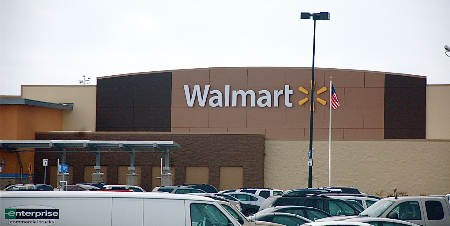
Recently i have been to a few different Walmart's which have all been recently redone. The old facades and color schemes have mostly been replaced. This language in design calls for the most modern and attractive color schemes which involve soft blues, browns, brick reds and yellows. The colors represent a kind of simplicity that is reflected in what Walmart attempts to offer its customers in a simplicity of shopping that relieves the consumer of shopping related stress.  The new color scheme is added to the deviation from plain warehouse-like- buildings to this one to the right. The soft and asymmetrical curves plus the new symbol offers something new to the consumer to look at. Modern things attract customers, and with walmarts very low prices it sort of sells itself and may have very little to actually do with the design, but i disagree. If you look closely at the latter picture the background its sort of a zoomed in version of the surrounding bricks, even though it is panel. The importance in looking modern is in that which attracts people to something and it seems to be that the point of anything consumer related is to attract. And everyone likes to have that new, cool thing.


[aka modern]

Sunday, April 3, 2011

Sayre RR11 IAR 221

Function = Modernity


Ultimate detail, avant garde design and freeing of space make up a great deal of innovative design in the post World War I world. The most intriguing pointed out by both Roth and Ching was Le Corbusier's Villa Savoye at Poissy, a suburb of Paris and is hailed to be one of the most influential of the time ( Ching 721 ). Everything about this Villa evokes the supreme in modern, stretching the limits and ideas of buildings.

Villa Savoye, Poissy, photo credit 
This photograph of the Villa Savoye captures the modernity of the building by contrasting its forward looking design with a grainy and ancient looking photo. This image reminds me of really old pictures people have taken of "alien spaceships", just because the building looks so modern and different than other designs of its time.

Floor Plan: Left- bottom floor garage/entrance. Right main floor mixed use spaces
Plan Credit
Truly floating above the ground by the use of "what Le Corbusier called pilotis (literally, 'piles,' or stilts)" the Villa Savoye also rests on top of a three car garage and reception area, which is influenced in its construction by the turning radius of an automobile (Roth 532).  This allows the car to enter and exit smoothly and easily and displays design for function, which could define the rest of the Villa in how it was constructed. Le Corbusier designed the main floor to be liquid in form in that it could change and appear according to the residents wishes. The following ideas are noted by Roth: " using a concrete frame, Le Corbusier could achieve a free plan, for no wall is structurally determined." Adding to this affect was the use of facade walls which, could be moved, opened or left to sit as desired by the resident. Letting the light in is a wrap around ribbon window which Roth defines as a "broad panorama painting."  The living spaces were divided by a kitchen, living, bedroom and dining room as well as the second floor outdoor living room. Open to the sky as well as allowing access to the roof top garden, many different spaces were available in the Villa Savoye.


Indoor/outdoor View. The terrace provided an indoor space, outdoors. Go Le Corbusier! And whose that in the left hand corner, but a Basculant LC2
Photo Credit

Before the use of heating and air conditioning  the use of glass played a large role in the temperature within buildings. Le Corbusier had drawn plans to make this building a symbiote with the sun in that it would allow for the heating in winter and a mechanical breezeway to keep it cool in the summer. These plans did not make it into the building, and design in that aspect is slightly flawed. This summer "hothouse" as Roth puts it was the first building to disallow the free movement of air through the building as it was "hermetically sealed". So, with air conditioning installed I bet this would be a very comfy home, not to mention functionally beautiful. In the Villa Savoye, I feel Le Corbusier used function as a very strong point in making this a very modern building incorporating innovation as well as the design language of the time.