What is being modern? To me and what i understand of design it is to give something to someone what they have not seen, heard, felt, tasted, or experienced.
 For people to gain notoriety, make money, attract consumers one has to produce something that is new. Otherwise known as modern. One thing that I've come to understand in this class of IAR221 is that mostly everything ever made was made out in the most modern fashion possible, unless otherwise meant to be something else. Its an idea that will carry on.
OBJECT: Camelback Water Bottle BPA free (this is the one i have!)
Camelback has succeeded in making a very popular item. This water bottle can be seen everywhere from gyms to mountaintops. I would argue that it has succeeded because of its design. Strictly design? Maybe. I've never seen an advertisement for this water bottle, besides what it advertises on the product itself. It succeeds possibly because of the name brand, which has enabled the designers to create a bottle that looks very modern with its shaded color container as well as its extremely functional cap + straw. This enables the user to hang it while keeping leaks away. I think function plus superior design has lent this bottle an image (dating from the 80's 90's???): "cool". And whats a different word for cool, but modern.
 |
| Empty Bottle Chicago (photo credit) |
I could use any bar that has a venue but this one fits the bill perfectly. When a new bar comes into town it has to sell itself to customers as well as bands. If a venue is designed poorly it won't attract anything. The specific space being analyzed here is the value of the stage and its effectiveness. The clean mix of modern lighting as well as the glossy feel of the stage and seating area appeases the crowd. It does it by being an attractive space, well lit and very open allows for great flow of air. Some venues fail in that it becomes very stuffy and smoky. This venue space allows for easy sight lines to the performers. This well designed space is effective in its modernity offering many things to the customer, basically being an attractive design.
 |
| Gatewood (UNCG) |
This isn't where i call home on campus so i feel like its alright to make comments on it. Anyway. I feel that this building meets all criteria for being modern. I feel like the idea here was to create a building in which you could see the art happen. This an ideal that is made possible by the wide openness of the windows. It basically looks like a glass house that offers its art to anyone who walks by. Indeed this building allows for the passerby to enjoy artwork that is within which could also possibly add to those being interested in going inside not only to look at art but to become a student. These ideas are what the design language says to me. Located on top of a hill it commands an excellent view around, and especially behind the building where the land drops back and away. This is definitely a time where it is important to see as well as be seen.

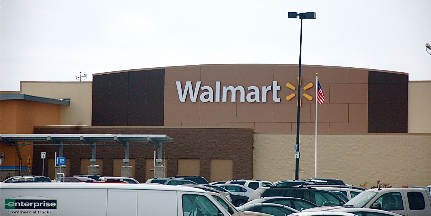 Recently i have been to a few different Walmart's which have all been recently redone. The old facades and color schemes have mostly been replaced. This language in design calls for the most modern and attractive color schemes which involve soft blues, browns, brick reds and yellows. The colors represent a kind of simplicity that is reflected in what Walmart attempts to offer its customers in a simplicity of shopping that relieves the consumer of shopping related stress. The new color scheme is added to the deviation from plain warehouse-like- buildings to this one to the right. The soft and asymmetrical curves plus the new symbol offers something new to the consumer to look at. Modern things attract customers, and with walmarts very low prices it sort of sells itself and may have very little to actually do with the design, but i disagree. If you look closely at the latter picture the background its sort of a zoomed in version of the surrounding bricks, even though it is panel. The importance in looking modern is in that which attracts people to something and it seems to be that the point of anything consumer related is to attract. And everyone likes to have that new, cool thing.
[aka modern]
I like the fact you addressed aesthetic values. Note the offeset proportions and curve as well. Would a higher curve or more offset length effect the shopper? Perhaps the ill proportions might cause confusion or a subconscious sickness that would turn the customer away. Perhaps modernism is the transforming of shape and form to entice the customer.
ReplyDelete